
 2021-03-19 23:47:18
DBSCAN and Gaussian Mixtures with gene expression data for Acute Myeloid Leukemia
This tutorial is the continuation of Clustering techniques with Gene Expression Data for Acute Myeloid Leukemia where we discussed algorithm belonging to partitional clustering (k-means) and hierarchical clustering.
For the Acute Myeloid Leukemia gene expression dataset loading refer to first part of the previous tutorial where the pre-processing of the dataset is explained.
You can find the first part: here.
Tutorial structure:
- Introduction to Density-based clustering
- Implementing DBSCAN in python
- Introduction to Gaussian Mixture Models
- Implementing Gaussian Mixture Models in python
- Previous tutorials
- bibliography
Introduction to Density-based clustering
Density-based clustering determines cluster assignment based on the density of data observations in particular region. Clusters are regions where there is high density of data points which are separated by low density regions. This approach doesn’t require you determine in advance how many clusters you require. Normally, you select a parameter (based on distance) that set a threshold to determines how a data has to be close to cluster to be considered a member of that cluster. In this tutorial we will use the DBSCAN algorithm which is one of the most used and cited algorithms for clustering.
As we have seen before, hierarchical and k-means clustering are not very able to form clusters based on varying density or when they have complex shapes. As we can see in figure 1, intuitively we see three different concentric clusters with some noise datapoints. Hierarchical clustering and k-means in this case are not performing well, they are not detecting well neither the clusters nor the noise. DBSCAN is identifying well in this case the clusters and separating the noise as outliers.
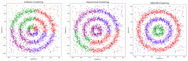
Fig 1. Source: adapted from here?
Density-based spatial clustering of applications with noise (DBSCAN) is a data clustering algorithm proposed by Martin Ester, Hans-Peter Kriegel, Jörg Sander and Xiaowei Xu in 1996 (1). DBSCAN groups data observation in a dense region in a cluster. One of the biggest advantages is that is very robust to outliers (data point which present extreme value or a very different from other data points). The general idea behind density-based clustering is that given a data point you want to find the data points in the space around (?-neighborhood, which is defined as the set of data points within distance ? from the data point p). in a 2-dimensional space the geometrical shape where all the point are equidistant from the center is a circle. In this case we can describe the concept of density, as the number of data point in a particular area (? radius in this context).
DBSCAN requires we set only two parameters:
- Eps or epsilon is the radius of the circle that has to be created around each observation in order to check the density. In a higher dimension space (more than 3 features or dimension), epsilon is the radius of a hypersphere. In concrete, epsilon is the distance between two neighbor data observation (two data point are considered neighbors if the distance between them is inferior or equal to eps).
- minPts the number of neighbor data observations inside the circle for that observation in order to be consider as core point. This is can be also summered as the minimum number of data observations in a cluster (or dense region).
Considering there two parameters we can define the data points as:
- core point: a point is considered core point if in the surrounding area (with epsilon radius) there at least a number of points equal to minPts (including that data point itself). In other words a core point is data point that in its neighborhood (with epsilon radius) there is a number or density of point equal to minPts.
- Border point: a border point is reachable from a core point (its distance from a core point is less than epsilon) but in its surrounding there is a number of points less than minPts
- Outlier: it is not a core point and it is not reachable from any core points
Let’s observe figure 2, epsilon represents the radius of the circles and minPts is 4. The red points are the core points because inside the radius epsilon there are at least 4 points. The yellow are border points because they are reachable from a core point (inside the circle of the core point) but inside their surrounding area there are not at least for points. Inside the B circle there are just 2 points, meaning that inside the radius epsilon starting from B the number of data points in the surrounding area is less the minPts. N instead is an outlier since is not a core point but it is also not reachable from any core points.
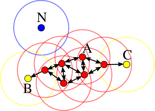
Fig 2. Figure source: here?
DBSCAN as other algorithm is Euclidean distance to measure the distance between data points (although other methods can be used). There are two ulterior concepts to understand:
- Reachability: if a data point can be accessed from another in a directly or indirectly manner
- Connectivity: weather 2 data observations are part of same cluster or not.
Considering these two concepts, in DBSCAN two data points can be referred to as:
- Directly Density-Reachable
- Density-Reachable
- Density-Connected
A point X is considered directly density-reachable from point Y, if X is in the neighborhood of Y ( the distance between X and Y is less than epsilon) and Y is a core point, as in Fig3 A.
A point X is density-reachable from Y if there is a chain of points (P1, P2, P3 and so on) each directly density reachable. Here X is not directly density reachable from Y but as we see in chain P3 is density-reachable from Y, P2 is density-reachable from P3 and X is density-reachable from P2 (Fig 3 B). As an analogy, two data points that are density-reachable as “friend of a friend”. The dimension of epsilon determines if two data points are density-reachable, choosing a smaller ?, fewer data points are density-reachable.
A point is densely connected from point Y, if it exists a point O such that both X and Y are density-reachable from O
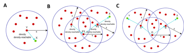
Fig 3. Adapted from: here
The algorithm work starting by a random point that has not been assigned to a cluster or considered an outlier, it computes the neighborhood and determines if that data point is a core point. If yes, it starts a cluster. If no, it labels the data point as an outlier.
When it finds a core point it starts the cluster and then it expands by adding all the directly-reachable points to the cluster. All the density-reachable points are added to the cluster. These two steps are re-iterated until all the points are inserted in a cluster or considered as outliers.
From this information, we can derive that DBSCAN is very sensitive to the value of epsilon and MinPts, variations of these values will change significantly the output.
minPts. It has to be set higher than 3 (if you set equal to 1, each point will be considered a separate cluster). Interestingly, selecting minPts as 2 is like performing hierarchical cluster with single link metric (and as the dendrogram was cut at distance epsilon). As a rule of thumb, generally minPts is selected as twice the number of features. Larger values of minPts are better for dataset with noise and generally larger is your dataset larger should be minPts.
Epsilon is generally selected as the elbow in the k-distance graph (which will look in details in a while). If epsilon is small a higher number of clusters is created, and many other data points will be considered as noise. A too small epsilon will be meaning that a large part of your data will be not clustered and it will be considered outliers. On the contrary, if epsilon is too big many small clusters will be joined in one bigger cluster. If you choose a too larger epsilon you can have most of the data points in just one cluster).
DBSCAN implementation in python
If we are using the default option, the results are not encouraging:
from sklearn.cluster import DBSCAN
dbscan=DBSCAN()
dbscan.fit(df)
pca_df["dbscan_labels"] = dbscan.labels_sns.set(style="whitegrid", palette="muted")
ax = sns.scatterplot(x="PCA1", y="PCA2", hue="dbscan_labels",  data=pca_df)
plt.legend(bbox_to_anchor=(1.05, 1), loc=2, borderaxespad=0.)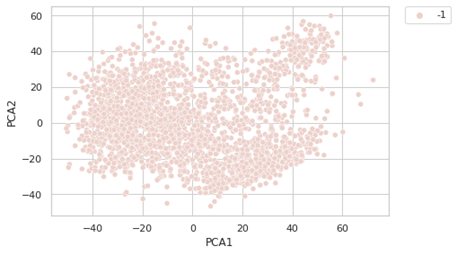
-1 is indicating that these points are outliers (here is considering all the points outliers. This is meaning the clustering is treating all the data points as noise. We have to optimize the value of epsilon and minPts. For founding the right value of epsilon, we are using the K-distance graph. We calculate the distance between a point and it nearest point (this is done for all the points in the dataset).
from sklearn.neighbors import NearestNeighbors
neigh = NearestNeighbors(n_neighbors=2)
nbrs = neigh.fit(df)
distances, indices = nbrs.kneighbors(df)# Plotting K-distance Graph
distances = np.sort(distances, axis=0)
distances = distances[:,1]
#plt.figure(figsize=(20,10))
plt.plot(distances)
plt.title(‘K-distance Graph’,fontsize=20)
plt.xlabel(‘Data Points sorted by distance’,fontsize=14)
plt.ylabel(‘Epsilon’,fontsize=14)
plt.show()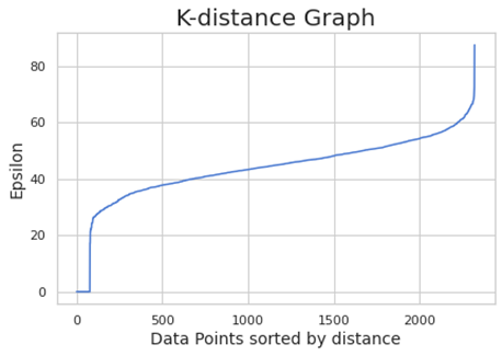
We choose the elbow value, the value of epsilon where there is the maximum curvature. Here is around 60. minPts depends from domain knowledge also (we are choosing here 50)
dbscan=DBSCAN(eps=60,min_samples=50)
dbscan.fit(df)
pca_df[“dbscan_labels”] = dbscan.labels_
sns.set(style=”whitegrid”, palette=”muted”)
ax = sns.scatterplot(x=”PCA1", y=”PCA2", hue=”dbscan_labels”, data=pca_df)
plt.legend(bbox_to_anchor=(1.05, 1), loc=2, borderaxespad=0.)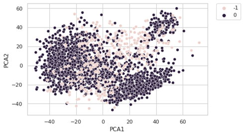
The results are not really convincing. One of the factors is the Euclidean distance which is not really a good choice with so many features. For this reason, we will perform DBSCAN on the PCA components.
from sklearn.neighbors import NearestNeighbors
neigh = NearestNeighbors(n_neighbors=2)
nbrs = neigh.fit(X)
distances, indices = nbrs.kneighbors(X)
# Plotting K-distance Graph
distances = np.sort(distances, axis=0)
distances = distances[:,1]
#plt.figure(figsize=(20,10))
plt.plot(distances)
plt.title(‘K-distance Graph’,fontsize=20)
plt.xlabel(‘Data Points sorted by distance’,fontsize=14)
plt.ylabel(‘Epsilon’,fontsize=14)
plt.show()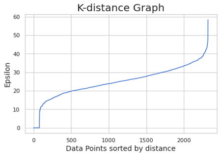
dbscan=DBSCAN(eps=40,min_samples=30)
dbscan.fit(X)
pca_df[“dbscan_labels”] = dbscan.labels_
pca_df[‘dbscan_labels’] = pca_df.dbscan_labels.astype(‘category’)sns.set(style=”whitegrid”, palette=”muted”)
ax = sns.scatterplot(x=”PCA1", y=”PCA2", hue=”dbscan_labels”, data=pca_df)
plt.legend(bbox_to_anchor=(1.05, 1), loc=2, borderaxespad=0.)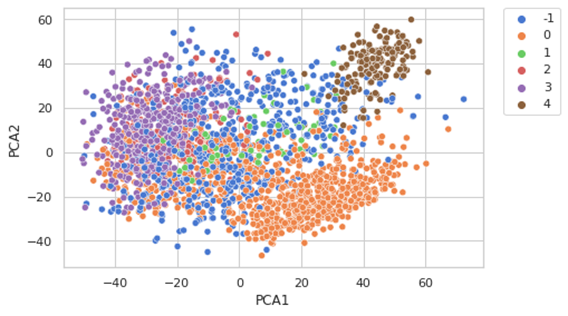
Some considerations:
- DBSCAN does not require we specify the number of clusters prior to use.
- It performs well with clusters with arbitrary shapes. DBSCAN can find non-linearly separable clusters. it can also identify clusters that are completely surrounded by other clusters (but not connected). Varying minPts you can also achieve good results in separation in the case of single-link effect (when two different clusters are connected by a thin line of points an may considered as a single clusters).
- It is robust to outliers and can be used in outlier detection.
- It requires only the setting of two paraments. However, sometimes it is not easy to determine the appropriate value of the parameters and it requires domain knowledge.
- It does perform well, if the clusters are very different in term of densities. This is due because it is difficult to find a combination of epsilon and minPts to be appropriate for all clusters.
- It is not entirely deterministic, border point that are reachable from more than one cluster can be insert in one cluster or another, depending the order the data are processed. While it is completely deterministic for core point and outliers.
- The quality of DBSCAN relies on the distance measure selected (normally the Euclidean distance). Euclidean distance is not scale invariant, meaning that is sensible to scaling of the features (normalize your data is a best practice). With high dimensional data (where the number of features is much higher than number of observations) the Euclidean distance is not returning good results. With the increase of the number of dimensionalities the result quality is decreasing (curse of dimensionality).
Introduction to Gaussian Mixture Models
Gaussian mixture model (GMMs) is a distribution-based model. GMMs assume that considering a dataset there are a certain number of Gaussian distributions, where each of these distributions represent a cluster. The principle is to assumes that our data point was generate starting from a latent variable which provide information to generate a data point. In the case of GMM the latent variable describe which Gaussian has generate that data point. In more simple word, GMM try to learn each cluster as a different gaussian distribution (it practically assumes that dataset has been generated by a mixture of gaussian models). However, we are not observing this latent variable, we have to estimate (using the expectation maximization algorithm).
Let’s start with the Gaussian distribution (also known as the normal distribution). It is a curve with a bell shape, where the data points are symmetrically distributed around the mean value. The gaussian distribution is defined by the mean (µ) and by the variance, higher is the variance more spread would be the curve (affecting the wideness of the bell). A different mean is meaning the Gaussian is shifted in the figure below, there are 4 different gaussian distributions with different mean and variance.
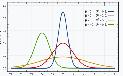
Fig 4. Source: here
Image we have three Gaussian distributions (which we can define as GD1, GD2 and GD3) and each one has its own mean (µ1, µ2, µ3) and its own variance (the standard deviation and the squared standard deviation is the variance). Considering a dataset (a set of data points) a Gaussian Mixture Model would identify the probability that a data point is belonging to each of these distributions. This because GMM are probabilistic models.
In the case we have three clusters (defined by different colors) and we choose a data point, we can calculate the probability is belonging to a particular cluster. As we in the fig 5A, the probability for the data point circled in red is 1 for the blue cluster, if we select another data point, we see that it has more probability to belong to the cyan cluster. Both data points have no probability to belong to the green cluster.
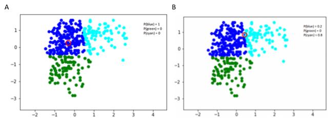
Fig 5. Figure source: adapted from: here
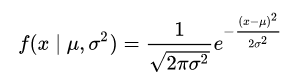
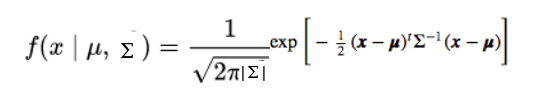
In one dimensional space, for the Gaussian distribution the probability density function (the probability density function is a measure of how likely the variable is to have a certain value) is:
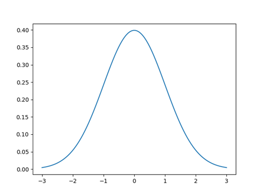
If we look to this example (fig 6) we have a Gaussian distribution with mean centered at 0 and standard deviation of 1, and it is the described by the function above. At 0 the probability to observe an input x with this specific gaussian distribution, is 40%. More we go far from the center the lower the probability it is, since a key property of the gaussian distribution is that the highest probability is at the center and it decreases with distance from the center, approaching zero. The sum of the value under of the curve is 1 (probability of 100 %).
This is true when we have just one variable like in Fig 4, while if we have two variables instead of a 2-dimensional curve we have a 3-dimensional curve. In this case the input is not anymore a scalar but a vector, and we have also a vector for the mean (the mean represents the center of our data so it has the same dimension of the input). The covariance instead is a matrix (2 x 2 in this case). The covariance matrix is storing also the information of the relationship between x and y, how y changes with change in x. In the next figure we see than a 3-d shaped curve, the color intensity represents the higher probability.
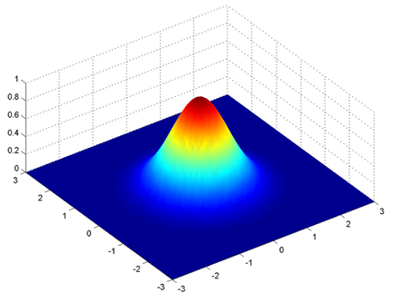
Fig 7. 3-dimensional bell-shaped curve. Figure source: adapted from: here
In this case the probability density function would be:
As said, here µ is a 2D vector and ? is the covariance matrix (2x2), as for the 2D curve the covariance is defining the shape of the curve. We can generalize this concept to a multi-dimensional dataset (let’s say N number of dimension), where the gaussian model would have a µ as a vector (the length would of this vector would be N) and a covariance matrix (N x N as matrix). Considering a dataset this will be described by a mixture of Gaussian distributions (the number of GD will be equal to the number of clusters) and each GD with µ vector and variance matrix.
Under the hood Gaussian Mixture Model uses the expectation-maximization algorithm (which we have already encountered discussing the k-means). The expectation-maximization (EM) algorithm is a statistical model that it is determining the latent variables (in this case the mean vector and the covariance matrix of the gaussian distributions representing the clusters). The idea behind is that EM uses the existing data to find the optimum values for the latent variables.
We want to assign k number of clusters: so, we have K gaussian distribution each one with µ vector and a ? matrix (or covariance matrix). In addition, we have another parameter that represents the number of points present in the distribution, or the density of the distribution. We need to find the value of these parameters to define each gaussian distribution. In the first step we assign a random value for each of these parameters.
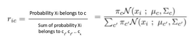
In the first step (expectation) we calculate the probability for each point that it belongs to each cluster (or distribuition) c1, c2… ck. GMM is using the Bayes Theorem to calculate this probability.
The value is high when the point is assigned to the right cluster.
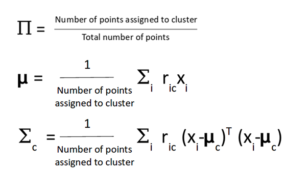
After that step, the value for µ, variance and the dirstibution are updated. The µ and covariance matrix are updated in proportion with the probability values for the data point (in concrete, if a data point has a higher probability to be part of this gaussian distribution will contribute more).
This process is iteratively and it is repeated in order to maximize the log-likelihood function.
Before to start with the code a precaution, GMM has been described as clustering algorithm but fundamentally it is an algorithm for density estimation. When you fit data to GMM is not technically generating a clustering, but a generative probabilistic model describing the distribution of the data (2). We will come back on this last point.
Implementing Gaussian Mixture Models in python
Main parameters:
- n_components: default 1, the number of gaussian mixture components we are selecting
- covariance_type: default “full”, describe the type of covariance parameter.
We are fitting the data on the PCA components.
from sklearn.decomposition import PCA
pca = PCA(n_components=50)
X = pca.fit(df).transform(df)#we fit the data
from sklearn.mixture import GaussianMixture
gmm = GaussianMixture(n_components=7)
gmm.fit(X)#we plot the results
pca_df["GMM_labels"] = gmm.predict(X)
pca_df['GMM_labels'] = pca_df.GMM_labels.astype('category')
sns.set(style="whitegrid", palette="muted")
ax = sns.scatterplot(x="PCA1", y="PCA2", hue="GMM_labels",  data=pca_df)
plt.legend(bbox_to_anchor=(1.05, 1), loc=2, borderaxespad=0.)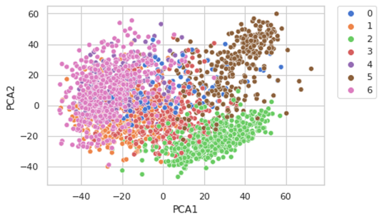
We have selected 7 components based on our prior knowledge, but it is not always possible so there are other methods. We will use 2, the Akaike information criterion (AIC) or the Bayesian information criterion (BIC).
- Akaike information criterion (AIC) is an estimator of prediction error and therefore an indicator of quality of a statistical model for a dataset. Applied to a model collection, it allows to estimate the quality of each models, providing a tool for model selection. AIC estimates the relative amount of information that is lost by each model, then you can derive that the less information a model loses, the higher quality. In practice, each model is losing information in respect to the so called “true model” and our wish is to select the model which loss less information.
- Bayesian information criterion (BIC) is another criterion for model selection. Increasing parameters, it leads to overfitting, AIC and BIC describe this trade off, and add a penalty to the increase of the parameter to avoid this issue (the penalty is bigger in BIC than in AIC).
n_components = np.arange(1, 21)
models = [GaussianMixture(n, covariance_type=’full’, random_state=0).fit(X) for n in n_components]plt.plot(n_components, [m.bic(X) for m in models], label=’BIC’)
plt.plot(n_components, [m.aic(X) for m in models], label=’AIC’)
plt.legend(loc=’best’)
plt.xlabel(‘n_components’)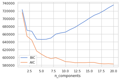
The optimal value for the parameter is where the AIC and BIC are minimizes. AIC tells here that around 7 Is a good choice but more components are better. The BIC suggest a range between 4–7, this is because BIC has an higher penalty and the suggests simpler model. So, it seems that seven is a good choice. A word of caution, this graph measures how well GMM works as a density estimator, not how well it works as clustering algorithm (2).
We discussed GMM as generative algorithm, a note on that. A generative model is describing the distribution of the data, so for this reason you can use the model to generate new data. In this context, patient data it has not a real meaning, but let’s try
new_data = gmm.sample(1000)
#since our data are returned in a tuple
gmm_components = new_data[:][0]
gmm_new_labels = new_data[:][1]new_df = pd.DataFrame(columns = ["x", "y", "gmm_new_labels"])
new_df["PCA1"] = gmm_components[:, 0]
new_df["PCA2"] = gmm_components[:, 1]
new_df["gmm_new_labels"] = gmm_new_labelsnew_df['gmm_new_labels'] = new_df.gmm_new_labels.astype('category')
sns.set(style="whitegrid", palette="muted")
ax = sns.scatterplot(x="PCA1", y="PCA2", hue="gmm_new_labels",  data=new_df)
plt.legend(bbox_to_anchor=(1.05, 1), loc=2, borderaxespad=0.)
The graph is similar to our original graph (even if these patients do not exist).
You can check here a better use for a generative model here where they used with handmade digits.
some considerations:
- GMM is also a generative model, this can be handy for some tasks
- GMMs can learn clusters with any elliptical shape. GMMs allows the possibility to exert flexibility in cluster covariance. K-means is a special case of GMM where each cluster’s covariance along all dimension approaches to zero.
- GMMs provide probabilities about how each data point is related to each cluster. Practically, the GMMS allow that every observation in a way is belonging to a more than a cluster, within a certain degree of uncertainty. GMM basically represent clusters as probability distribution. Mixed membership for the cluster (data point belonging to different clusters to a different degree) is useful for some tasks (you can image news article that are belonging to multiple topic clusters). In k-means the probability that one point is belong to one cluster 1 (0 for all the other clusters, again explaining why k-means is practically a special case of GMM) and this is the reason why k-means generates only spherical clusters. This also called as soft classification in comparison to hard classification (k-means).
- We still need to define in advance the number of clusters we want.
- The algorithm for optimize the GMM loss function is not trivial and complex (Expectation Maximization is the most popular). The algorithm can encounter local maxima, which are not the global best
- GMM is hard to initialize when you have a dataset with large dimensionality (much more features than observations). For this reason, we started on the PCA components.
- The central limit theorem states that as we collect more and more samples (or observation) for a dataset, it will resemble a gaussian distribution
Previous tutorials
On complexity reduction techniques and visualization: here
For more information:
On acute myeloid leukemia: here
On medical image analysis an AI: here
On artificial intelligence on biological data: here


