
 2021-04-23 16:05:46
A complete guide to linear regression using gene expression data for Acute Myeloid Leukemia: Part 2 — Fit and algorithm evaluation
In this second tutorial, I will show how to fit a linear regression model to predict Acute Myeloid Leukemia, how to evaluate the results. Moreover, I will discuss the plots to investigate the algorithm results and solutions to the most common problems.
You can find here the previous tutorial: here
Fit a simple linear regression model
from sklearn.model_selection import train_test_split
from sklearn.linear_model import LinearRegression
from sklearn import metrics#inputs and dependent variable
X = df.drop(“MYC”, 1)
y = df[“MYC”]#dividing in train and test set
X_train, X_test, y_train, y_test = train_test_split(X, y, test_size=0.2, random_state=0)
Let’s give a look at our dependent variable.
sns.set(style="whitegrid", palette="muted")
sns.histplot(data=y, x=y)
plt.legend(bbox_to_anchor=(1.05, 1), loc=2, borderaxespad=0.)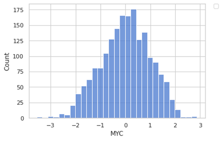
It looks like a normal distribution. We have a negative value since we have scaled our data (something is always better to do when you are using linear regression.
Now let’s start to fit our model in the easiest way.
model = LinearRegression()
model.fit(X_train, y_train)#the intercept:
print(model.intercept_)#the slope:
print(model.coef_)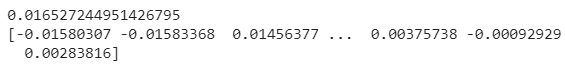
As we have seen before in the previous section, under the hood the regressor is calculating an intercept and a set of weights (the coefficient for each input variable). Since we have many weights, we a vector.
Since now we have a trained model, we can do some predictions.
y_pred = model.predict(X_test)
pred = pd.DataFrame({'True_value': y_test, 'Predicted': y_pred})
pred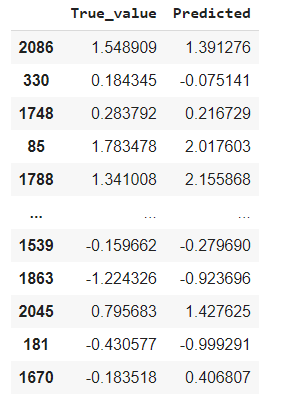
And we are plotting the results for the 25 examples
pred1 = pred.head(25)
pred1.plot(kind='bar',figsize=(16,10))
plt.grid(which='major', linestyle='-', linewidth='0.5', color='green')
plt.grid(which='minor', linestyle=':', linewidth='0.5', color='black')
plt.show()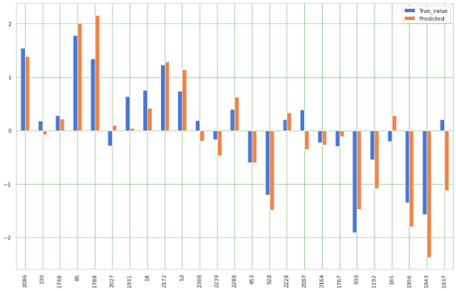
Algorithm evaluation: error metrics, assumptions, plots, and solutions
An important step is to evaluate our algorithm, this is also useful when we want to compare different algorithms (or different models, when we use different parameters). let’s consider some of the most commonly used evaluation metrics:
- Mean absolute error (MAE), which is the mean of the absolute value of the errors
- Mean squared error (MSE), which is the mean of the squared error
- Root Mean Squared Error (RMSE) which is the root of the mean of the squared errors
- R-squared, which represents the percent of variance explained by the model. The R2 ranges from 0 to 1 (or it can be expressed in percentage). it estimates the relationship between movements of a dependent variable based on independent variable movements. A larger R2 indicated a better fit

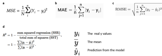
Fig 12. Source: here
print('Mean Absolute Error:', metrics.mean_absolute_error(y_test, y_pred))
print('Mean Squared Error:', metrics.mean_squared_error(y_test, y_pred))
print('Root Mean Squared Error:', np.sqrt(metrics.mean_squared_error(y_test, y_pred)))
print('coefficient of determination:', model.score(X_test, y_test))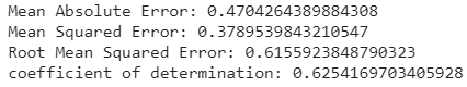
Another way to score your model is to use Akaike and Bayesian Information Criterion (they are base on the log-likelihood and complexity). These scores provide information on the model performance taking into account also the model complexity. Also, a benefit is they do not need a test set. The limitation is that you have to calculate these scores for each model you test. Another limitation is that they favor a simple model without taking it into account. Each score is calculated using the log-likelihood for the model and the dataset (this comes from the Maximum Likelihood Estimation, a technique for optimizing the parameters of a model). We will take into account three scores:
- Akaike Information Criterion (AIC). Derived from frequentist probability. You in general select the model with the lowest AIC. There is a penalization for model complexity, but it put more emphasis on model performance.
- Bayesian Information Criterion (BIC). Derived from Bayesian probability. You in general select the model with the lowest BIC. The BIC score penalizes more the complex model than the AIC. Since it derives from Bayesian probability, the selection of the candidate includes a true model, meaning that the probability that BIC selects a true model is increasing with the size of the training set. This is also a drawback in the case of small and poorly representative datasets, in that case, BIC will select models that are too simple.
- Minimum Description Length (MDL). Derived from information theory. You in general select the model with the lowest MDL. The principle is that it favors the simplest model which explains that predicted target variable. MDL can be equivalent to BIC in some situations.
I will show you the calculation for the first two. For a singular model:
from math import log
model = LinearRegression()
model.fit(X_train, y_train)# number of parameters
num_params = len(model.coef_) + 1
print('Number of parameters: %d' % (num_params))# predict the training set
yhat = model.predict(X_train)# calculate the error
mse = metrics.mean_squared_error(y_train, yhat)# calculate aic for regression
def calculate_aic(n, mse, num_params):
  aic = n * log(mse) + 2 * num_params
  return aic# calculate the aic
aic = calculate_aic(len(y_train), mse, num_params)
print('AIC: %.3f' % aic)# calculate bic for regression
def calculate_bic(n, mse, num_params):
  bic = n * log(mse) + num_params * log(n)
  return bic# calculate the bic
bic = calculate_bic(len(y_train), mse, num_params)
print('BIC: %.3f' % bic)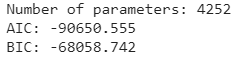
We can do a loop to calculate using only some features, let’s give a look
from sklearn.linear_model import Lasso
features = [10, 50, 75, 100, 250, 500, 750, 1000, 1250, 1500]
AIC = []
BIC = []
par = []for f in features:
  m = LinearRegression().fit(X_train.iloc[:, 0:f], y_train)
  num_params = len(m.coef_) + 1
  yhat = m.predict(X_train.iloc[:, 0:f])
  mse = metrics.mean_squared_error(y_train, yhat)
  aic = calculate_aic(len(y_train), mse, num_params)
  bic = calculate_bic(len(y_train), mse, num_params)
  AIC.append(aic)
  BIC.append(bic)
  par.append(num_params)#the plot
plt.plot(par, BIC, label='BIC')
plt.plot(par, AIC, label='AIC')
plt.legend(loc='best')
plt.xlabel('num_params')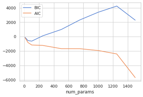
AIC and BIC are normally positive, but that can be negative. In the case of AIC is usually positive but can be shifted by an additive constant, but you consider the relative values to compare models (8). Actually, the absolute value doesn’t count, but the differences. So, we should the model with the minimum value.
As we can see in this figure, we can plot the prediction and actual value, the left plot shows a much more precise model.
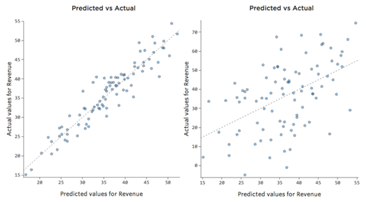
Fig 13. Figure source: here
.
We can plot the predicted y and the actual y of our model.
x_plot = plt.scatter(y_test, y_pred, c=’b’)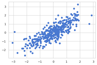
Some assumptions:
- Linear assumption. Linear regression is capturing the relationship between input and output variables, assuming there is a linear relationship. When you have a not perfect fit, you can transform your variables to be linear (for example log-transformed). If we fit our model to a non-linear non-additive our model would fail to capture the trend (and it would make bad predictions).
- Collinearity between the features. Collinearity is a measure to calculate the importance of a feature of a dataset. If your features are very correlated to each other, linear regression can fail to approximate the relationship and overfits. If we many correlated features is hard to figure out which one is really important and really contributing to predict the response variable. With many correlating features, the error increase, and the model are less precise in estimating the weights (this happens because the weight of a predictor depends on the correlated predictors).
- The error terms should be normally distributed.
- The error terms should have a constant variance (which is called homoskedasticity). The presence of a non-constant variance is called heteroskedasticity
Based on these assumptions we will look to some regression plots to check better our model.
The first plot we discuss is residual versus fitted values. Has you can see is a scatter plot showing the distribution of the residuals (or errors, h(xi) — yi) versus the fitted values (or predicted values h(xi)). One nice thing is that this plot is revealing also the outliers, in the figure they are labeled with their observation number in the dataset. Conceptually if there exists any pattern, this is a sign of non-linearity (and the model does not capture non-linear relationships). If you see a funnel shape, this is a sign of heteroskedasticity (non-constant variance in the errors). In general, a solution is to do a linear transformation of your data (log transformation, etc…).
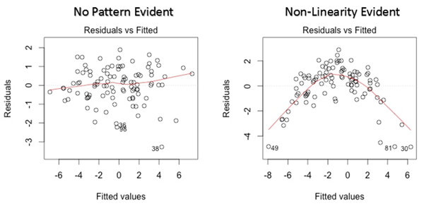
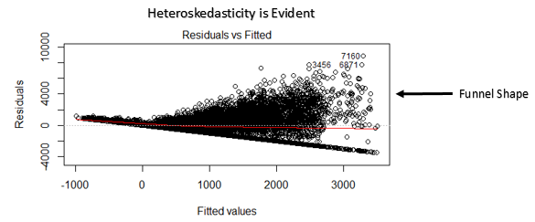
Fig 14. Figure source: here
Here other examples of some troubles you can encounter. Let’s observe the next figure. In general, as we said if you encounter some patterns there are some troubles with your data. This type of plot is giving you an indication of what type of issues you have.
- The top left is an example where the Y-axis is unbalanced. Generally, is when you have most of the y-value that falls in a particular range, and then you have some which are out of this range. Imagine you are selling books, the y variable is the number of books sold every day of a year, typically you sell a low number but for some days of the year a lot more (like Christmas, saint valentine and so on). This is translated that we have some predictions that are too high and some too low. Generally, you fix this by transforming the response variable or pay attention if you have missed an important dependent variable that would explain the behavior of your data.
- The top-right plot is a typical example of heteroskedasticity, which we can see from the funnel-shaped curve. This basically is meaning that the residuals become larger as the predictions move from small to large (it can happen also on the contrary). Looking at the bookshop example, (with two simple variables, x the day number of the year, y the amount of book sold) image that for a certain reason during the first month of the year you sell less and then last months (autumn) you sell more. Your plot would look like this. While is not inherently a problem it often means you can improve your model. Also, in this case, most of the time the solution is to transform a variable or that a variable is missing.
- The bottom left plot is an example of a non-linear pattern. To keep our example in mind, let’s say that during winter and autumn is difficult to sell books (people, when it is too cold, prefer to stay home and not to come to your bookstore). This model is not working for predictions. You will notice a very low R2. Sometimes, even if you notice something similar in this plot (maybe not so extreme) your model is not working so badly in prediction looking at prediction-actual value plot. In this case, you may use your model for some predictions but not as an explanatory model. The solution sometimes is that you need to transform one of your variables or a missing variable. Take into account when you a similar shape, that probably you need a nonlinear model.
- In the bottom right plot, in this case, you have a clear outlier. In our example, imagine we make a mistake, and instead, to sign a day as 200 we list it as 2000. Clearly a mistake, in our example. An outlier can have different origins, so we have to choose as to handle them. The outliers in the inputs are affecting the regression model. In general, the solution is to check the data, if it’s a data entry error you just delete it. In some cases, one of the variables is not normally distributed but is an asymmetric distribution and you can transform it. If it is a real outlier, you should assess it is impact and decide if it is to remove or not. How can you assess it? You can delete that data point and check if the coefficients change, if they are not changing much you can leave the data point. Generally, you should delete an outlier if you have a reason: like in our example, one day a rich guy comes and buy half of the books in the bookstore. In another case, you have some outliers but they are not really outliers, it is just that you have not enough data.
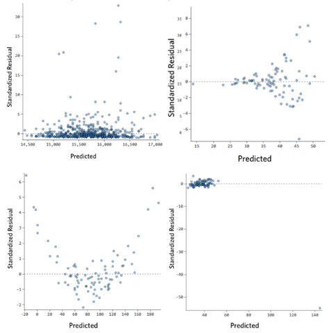
Fig 15. Figure source: here?
Let’s do this plot with our data.
x_plot = plt.scatter( y_pred, (y_pred - y_test), c='b')
plt.style.use('seaborn')
plt.xlabel('Fitted values')
plt.ylabel('residuals')
plt.title('Residuals vs Fitted')
plt.axhline(y=0, color='red', linestyle='dashed')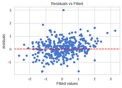
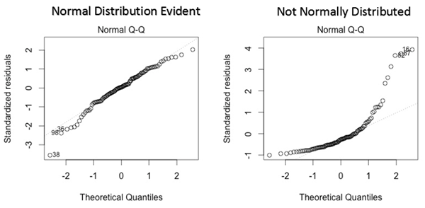
Another plot you can use is the normal q-q plot (quantile-quantile), this plot allows us to validate the assumption of the normal distribution (this plot infer if the data comes from a normal gaussian distribution). A quantile is a point that divides a distribution in the continuous intervals (practically inside a quantile falls a certain amount of data, like an example quantile can be also called as percentiles, so the 50th percentile is the number where half of the data are lies below). If the data are coming from a normal distribution they will fit a straight line. If you have any errors that are not normally distributed, a non-linear transformation of the variables can improve the models.
Let see our graph.
import statsmodels.api as sm
import pylab
sm.qqplot((y_pred - y_test), line='45')
pylab.show()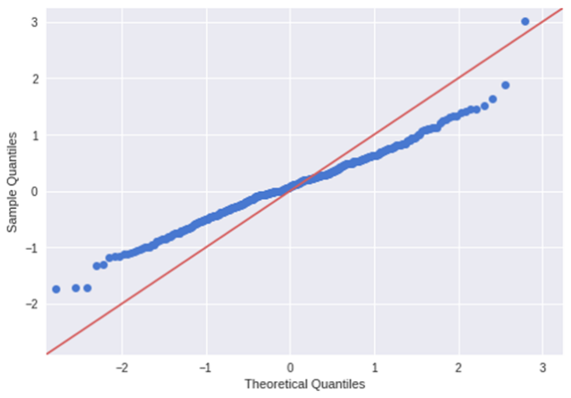
As we can see the distribution is different from a normal distribution.
Let’s see another plot: scale-location plot. This also used to detect homoskedasticity/ heteroskedasticity. It shows how the residuals are spread along with the range of predictors (it is similar to the first plot we have seen: residual vs fitted value). You should discern no pattern, meaning that the errors are normally distributed. If you find a pattern (for example a funnel shape) the errors are non-normally distributed.
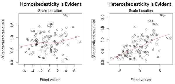
Fig 17. Figure source: here
and in our case:
residuals =(y_pred - y_test)
mean = np.mean(residuals)
std = np.std(residuals)
StdResidual =(residuals -mean)/std
SqrtrStdResidual = np.sqrt(np.absolute(StdResidual))
x_plot = plt.scatter( y_pred, SqrtrStdResidual, c='b')
plt.style.use('seaborn')
plt.xlabel('Fitted values')
plt.ylabel('square root standard residuals')
plt.title('Scale location')
plt.axhline(y=0, color='red', linestyle='dashed')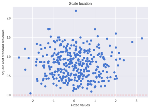
The last plot we will discuss is the residual versus leverage plot (also known as Cook’s Distance plot). This plot attempts to identify which points have more influence on other points. These points tend to have a major impact on the regression line (if you remove these points the model statistics will dramatic changes). Only looking at the data, you will know if they are outliers or not. So the points marked by major distance in the plot should be investigated.
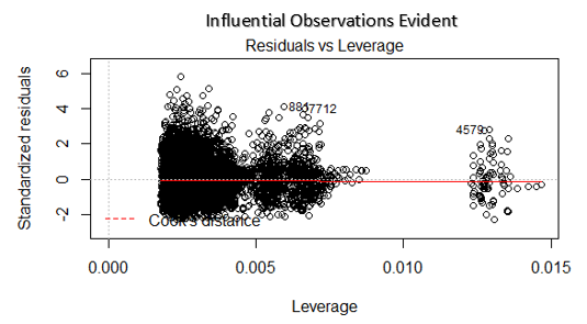
Fig 18. Figure source: here
import statsmodels.api as sm
#fit the model
mod = sm.OLS(y_train, X_train).fit()
res = pd.DataFrame()
res['resid_std'] = mod.resid_pearson
influence = mod.get_influence()
res['leverage'] = influence.hat_matrix_diag
#the plot
x_plot = plt.scatter( res['leverage'], res['resid_std'], c='b')
plt.style.use('seaborn')
plt.xlabel('Leverage')
plt.ylabel('square root standard residuals')
plt.title('Residuals vs Leverage')
plt.axhline(y=0, color='red', linestyle='dashed')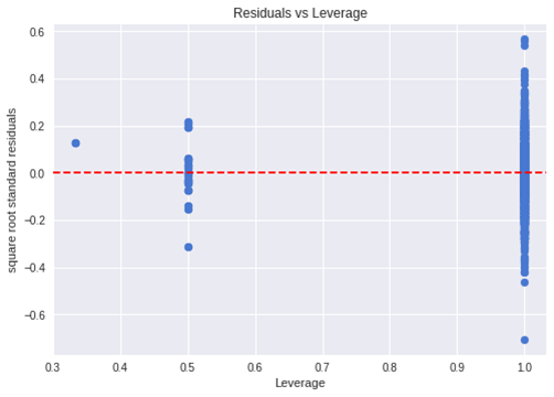
This library has a nice result summary:
mod.summary()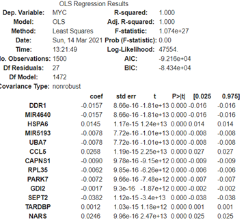
We said before that many times transforming a variable is a solution. Here an example: as you see the variable distribution is asymmetrical, once you log transform it has a bell-shaped distribution (close to a normal distribution). Regression is working better with the more symmetrical, bell-shaped curve. In this case, is dramatically improving the R2. There are also other kinds of transformations you can try. But since you cannot use if you have a negative number the log transformation, in that case, you can try square or cure root. Another solution if you have a lot of zeros, is to take log(x+1) this adds a little bias but the effect is not dramatic.
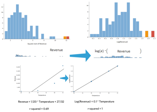
Fig 19. Figure source: here
Another thing is feature engineering; you can combine some variables. This will be better discussed in other tutorials but sometimes it useful to combine two variables (like the mean of the two, the product, the addition of the two it can be more informative of the two alone.
Briefly, how to improve non-linearity in some cases. Look at the image below there is a clear non-linearity relationship. This is much better summarized by a relationship y = x^2 + x + 1 than y = x + 1. Basically, adding a quadratic term will improve the fitting of the curve, the prediction, and the residual plot. This is a polynomial regression and it is out of the scope of this tutorial.
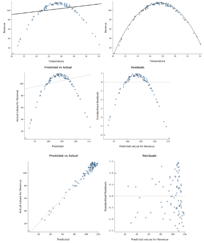
Fig 20. Figure source: here
let’s discuss also multicollinearity. In practice, multicollinearity in a regression model is when two or more independent variables are highly correlated (in other words, you can predict one independent variable using another independent variable). As an example, you travel for work using the train and when you travel you eat at the restaurant if you want to predict your expenses train ticket cost and restaurant cost are highly correlated. We cannot individually determine the impact of train ticket and restaurant cost on the expenses because are highly correlated. This problem resides in the equation we have seen before:
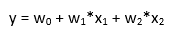
change in one coefficient will be reflected in the other one, making it difficult to distinguish the effect of x1 on y from the effect of x2 on y. multicollinearity may not affect the model accuracy, but then we cannot know the effect of singular features (we lose the interpretability of the model).
What causes multicollinearity?
- Dataset origin. Poorly designed experiments, high observational data, or poor preprocessing
- Feature engineering. Some variables are created from another but there are redundant.
- Identical variables. As an example, you have distance in kilometers and miles.
- Dummy variables. Example dummy variables that are saying the same things (example: a weather variable that has two values: sunny or rainy day. If you create two dummy variables (0/1) one for sunny and one for rainy, the two variables are basically saying the same).
- Insufficient data can lead to multicollinearity in some cases.
One thing you can do is to do a pair plot and look at your variables to see if they are correlating.
We are selecting only a few variables for this example.
X_short = X_train.iloc[:, 0:5]sns.pairplot(X_short)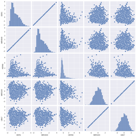
Another thing you can do is to calculate a correlation matrix and do a heatmap:
# Compute the correlation matrix
X_short = X_train.iloc[:, 0:20]
sns.set_theme(style="white")
corr = X_short.corr()# Generate a mask for the upper triangle
mask = np.triu(np.ones_like(corr, dtype=bool))
# Set up the matplotlib figure
f, ax = plt.subplots(figsize=(11, 9))
# Generate a custom diverging colormap
cmap = sns.diverging_palette(230, 20, as_cmap=True)# Draw the heatmap with the mask and correct aspect ratio
sns.heatmap(corr, mask=mask, cmap=cmap,  center=0, square=True, linewidths=.5, cbar_kws={"shrink": .5})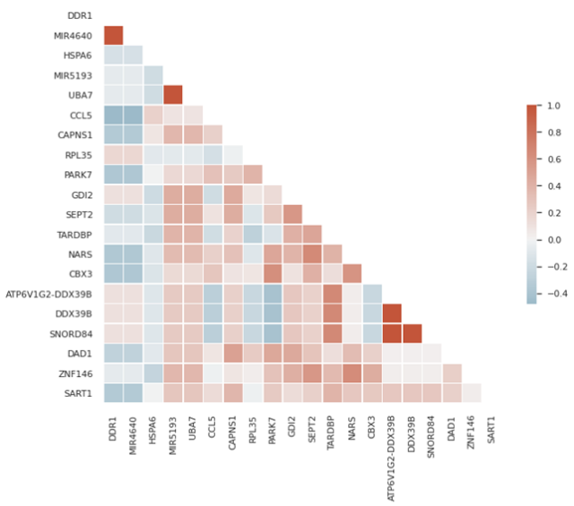
There are also other methods, the most common is VIF (Variable Inflation Factors). VIF calculates the strength of correlation between two independent variables (it determines taking a variable and regressing it against every other variable). The result is a score that represents how well the variable is explained by other independent variables. This is the formula:
VIF starts at 1 (equal 1 is meaning that the variable has no correlation with other variables) and the is no upper limit (normally over 5 or 10 this indicates high multicollinearity between this independent variable and the others).
Then let’s see in our dataset. We will use a subset of our dataset (because the algorithm is quite slow).
# Import library
from statsmodels.stats.outliers_influence import variance_inflation_factor#VIF calculation for whole dataset
def calc_vif(X):
  # Calculating VIF
  vif = pd.DataFrame()
  vif["variables"] = X.columns
  vif["VIF"] = [variance_inflation_factor(X.values, i) for i in range(X.shape[1])]
  return(vif)#for our dataset
X_short = X_train.iloc[:, 100:200] #we take a subset
vif = calc_vif(X_short)
vif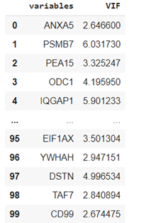
If we want to drop the variables that have a VIF score of more than five:
vif_drop = vif[vif.VIF > 5]
names = vif_drop.variables.tolist()
X_short.drop(names, axis=1, inplace=True)
X_short.shape
For this section, we will discuss the last thing,
Outliers
. Outlier is generally a value that is distant from the other. Cook’s distance is a popular method to calculate the data point’s influence (basically to find influential outliers). Generally, if a data point has a Cook’s distance higher than 3 times the mean is a possible outlier, all the points with more than 4 should be examined.
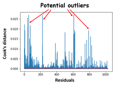
Fig 21. Figure source: here
.
!pip install -U yellowbrick
from yellowbrick.regressor import CooksDistance
# Instantiate and fit the visualizer
visualizer = CooksDistance()
visualizer.fit(X_train, y_train)
visualizer.show()